

Place 3–5 trust signals as close as possible to your buy box, repeat a reduced set in the cart, and show only payment and security badges beside your payment form at checkout. That single placement principle, applied consistently across your product pages, cart, and checkout, is where ecommerce trust badge placement delivers its clearest conversion lift. A footer row adds ambient reassurance site-wide but rarely drives direct attribution on its own.
Start with these highest-priority badges before adding anything else:
- Payment logos: Visa, Mastercard, PayPal, and commonly used payment options relevant to your local market
- Secure checkout seal: a clickable, verified badge from a recognised provider
- Returns or money-back guarantee: specific timeframe, e.g. “30-day money-back guarantee”
- Delivery promise: a concrete shipping promise relevant to your store
- Star rating or review badge: a review badge showing your verified customer rating
Get those five in place near your add-to-cart button first. Everything else is secondary.
Key takeaways
Effective ecommerce trust badge placement concentrates 3–5 targeted signals at the buy box, repeats a reduced set in the cart, and limits checkout to payment and security badges only.
| Point | Details |
|---|---|
| Buy box is the priority | Place 3–5 trust signals near the add-to-cart button on every product page. |
| Cart reduces abandonment | Show a guarantee badge and secure checkout seal near the cart CTA, nothing more. |
| Checkout: payment and security only | One verified security seal and payment logos beside the payment form is the right limit. |
| Test with funnel metrics | Measure add-to-cart rate, cart abandonment, and checkout completion — not clicks. |
| West Legacy Group | Provides Shopify and WooCommerce badge implementation, copy, and A/B test setup for Australian stores. |
Table of Contents
- Which placement patterns work best for ecommerce trust badges?
- How to place trust badges across the full purchase funnel
- Which trust badge types should you use, and where?
- Design and copy rules that make trust badges credible
- How to test badge placement and measure real impact
- Implementation steps for Shopify and WooCommerce
- Common mistakes that make trust badges backfire
- What actually moves the needle for small Australian stores
- West Legacy Group can help you place and test trust badges
- Sources
Which placement patterns work best for ecommerce trust badges?
Three patterns cover the vast majority of ecommerce trust badge placement decisions. Understanding the trade-offs between them helps you prioritise where to spend your implementation effort. According to ecommerce design pattern research, each pattern has distinct strengths depending on your store type and funnel stage.
Footer row
A horizontal row of payment and security logos in the footer appears on every page. It’s the most common pattern and the easiest to implement, but it sits below the fold on most devices and has low direct attribution for conversion lift. Many stores overuse it as their only trust placement, which limits its impact.
Inline row above add-to-cart
A compact row of 3–5 badges placed directly above or below the add-to-cart button on your product detail page (PDP). This is the highest-impact placement for most stores because it addresses shopper hesitation at the exact moment of decision. It requires more careful design to avoid cluttering the buy box.
Dedicated trust section
A standalone section, often below the fold on the PDP or on a landing page, that expands on your guarantees, certifications, and policies with short explanatory copy. It works well for high-average-order-value (AOV) products where shoppers need more reassurance before committing.
| Pattern | Pros | Cons | Best for | Ease of implementation |
|---|---|---|---|---|
| Footer row | Site-wide coverage, low maintenance | Below the fold, low direct conversion attribution | All stores as a baseline layer | Easy — one template edit |
| Inline above add-to-cart | High visibility at decision point, directly addresses purchase hesitation | Requires design care to avoid clutter | First-time shoppers, mid-to-high AOV stores | Moderate — PDP template edit |
| Dedicated trust section | Space for detail, works well for complex or premium products | Below the fold, adds page length | High-AOV items, campaign landing pages | Moderate — new section component |
Most stores benefit from combining the footer row as a baseline with an inline row on the PDP. Add a dedicated trust section only when your product price or complexity warrants the extra explanation.
Pro Tip: Mixing patterns is fine, but avoid repeating identical badge sets in two visible locations on the same page. Show your full set near the buy box, then use a single-line footer row for ambient coverage. Duplication reads as noise, not reassurance.
How to place trust badges across the full purchase funnel
Placement decisions change at each stage of the funnel because shopper concerns shift. A step-by-step map keeps your trust symbols relevant rather than repetitive.
-
Product page (PDP) — buy box zone. Place 3–5 signals within close proximity to the price and add-to-cart button. The recommended mix: one security seal, payment logos (Visa, Mastercard, PayPal, Afterpay/Zip), and one guarantee or returns badge. Security badges near payment fields and guarantee badges near CTAs address the specific shopper concerns at those moments. Keep the badge row tight to the CTA, ideally within 50px where your theme allows.
-
Cart page or drawer. Reinforce confidence with a reduced set: your returns/money-back guarantee and a secure checkout badge near the checkout CTA and subtotal. Drop the payment logo row here — shoppers already know you accept their card. The goal is to reduce cart abandonment, not to re-introduce your full badge set.
-
Checkout page. Focus exclusively on payment logos and a verified security seal placed directly beside or below the payment form. A one-line guarantee reminder (“30-day returns — no questions asked”) is acceptable if it fits without crowding the form. This is where a clickable, verified badge matters most because shoppers are entering card details.
-
Post-purchase (order confirmation and receipts). Use this touchpoint to reinforce your policy links — returns policy, warranty, and contact details. A verified review badge inviting the customer to leave feedback also fits naturally here and builds your social proof for future shoppers.
-
Mobile-specific rules. Limit your PDP badge row to 2–3 signals on small screens. Badge overcrowding on mobile reduces legibility and can hurt conversion, so prioritise your guarantee and one payment logo over a full row. Check that your CTA button remains above the fold after adding badges.
Pro Tip: On mobile, a single text-based line (“Free 30-day returns · Secure checkout · Afterpay available”) often outperforms a row of small logos that become illegible at 320px. Test both formats.
Which trust badge types should you use, and where?
Each badge type addresses a different shopper concern. Matching the right badge to the right moment is what separates effective ecommerce trust symbols from visual clutter.
-
Security seals (e.g., Norton, SiteLock, TrustedSite). Address data safety anxiety. Place one verified, clickable seal at checkout beside the payment form. Earned, verifiable badges with clickable verification pages hold up better than decorative graphics because sceptical shoppers can validate them immediately. One seal is enough — stacking multiple security logos suggests insecurity rather than confidence.
-
Payment logos (Visa, Mastercard, PayPal, Afterpay, Zip). Address payment acceptance uncertainty. Show these on the PDP buy box and at checkout. For Australian stores, including Afterpay and Zip is particularly relevant given their widespread adoption among local shoppers.
-
Guarantee and returns badges. Address returns anxiety. A specific guarantee such as “30-day money-back” outperforms vague phrases like “satisfaction guaranteed” because specificity reduces perceived risk. Place on the PDP and cart. Always link the badge to your actual returns policy page.
-
Shipping and delivery badges. Address fulfilment uncertainty. “Free shipping over $75” or “Ships same day before 2PM AEST” are concrete claims that work well near the buy box. Vague claims like “fast shipping” add little.
-
Review and social proof badges (Trustpilot, Google Reviews). Address credibility uncertainty. A star rating badge with a verified review count works well on the PDP and homepage hero. Link it to your live review profile so shoppers can read the reviews directly.
-
Niche or industry-specific badges. Certifications relevant to your product category (e.g., Australian Made, organic certification, industry body membership) belong on the PDP where they directly support the purchase decision, not buried in the footer.
Design and copy rules that make trust badges credible
A poorly designed badge can actively damage trust. Poorly designed or visually inconsistent badges can backfire, so visual fit and copy precision matter as much as placement.
Visual dos and don’ts:
- Use badges that match your site’s colour palette or are neutral enough to sit cleanly alongside your design. A garish green shield on a minimal white store looks out of place.
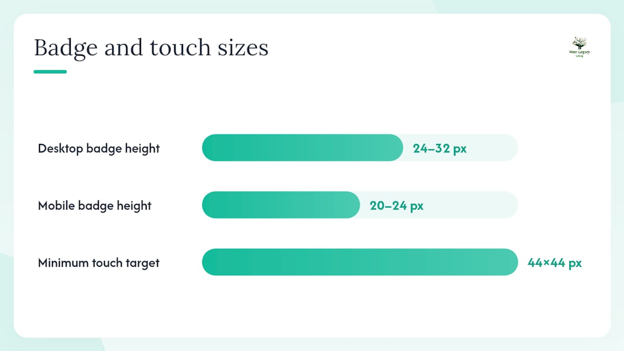
- Keep badge height consistent in a row (24–32px on desktop, 20–24px on mobile). Mismatched sizes look amateur.
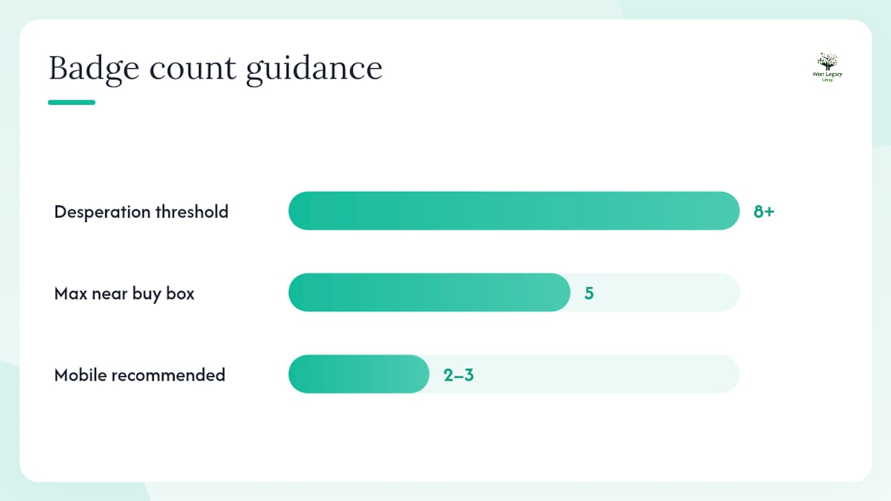
- Limit your buy box badge row to 5 items maximum on desktop, 2–3 on mobile. More than that creates a logo wall that shoppers scan past.
- Avoid low-resolution or stretched badge images. Use SVG format where possible for crisp rendering at any screen size.
Copy guidance:
- Write guarantee claims with a specific timeframe: “30-day money-back guarantee” not “hassle-free returns.” Plain-language, specific claims reduce perceived risk more effectively than vague promises.
- Link every guarantee or policy badge to the relevant policy page. A badge with no backing page is a credibility risk, not an asset.
- Avoid superlatives (“Australia’s safest checkout”) unless you can substantiate them. Under Australian Consumer Law, misleading claims carry real consequences.
Accessibility:
- Every badge icon needs descriptive alt text or an accessible label (e.g.,
aria-label="Verified secure checkout"). - Touch targets on mobile should be at least 44x44px if the badge is clickable.
- Check that keyboard focus order passes through clickable badges logically.
Pro Tip: Text-based trust signals near the buy box — such as “Free 30-day returns” written in your body font — often outperform logo badges in A/B tests because they are immediately legible and don’t depend on brand recognition. Run a text-vs-logo test before committing to a full badge design.
How to test badge placement and measure real impact
Testing removes the guesswork from trust badge decisions. Measure impact with direct funnel metrics rather than vanity clicks: add-to-cart rate, cart-to-checkout conversion, checkout completion rate, and cart abandonment rate. Average order value is worth tracking when your badges affect shipping thresholds or promotions.
A practical test matrix to start with:
Run one test at a time on a single page type. Wait for statistical significance before drawing conclusions — a common pitfall is calling a winner after two days when seasonal traffic patterns or a promotional email skew the sample.
Avoid running sequential tests without a holdout period. If you change the badge and then change the copy in the same week, you cannot attribute the lift to either change. Multivariate testing (testing multiple badge positions and types simultaneously) is worth considering once you have consistent traffic above roughly 10,000 sessions per month per page type. Below that threshold, stick to simple A/B tests to reach significance faster.
Measuring impact through funnel metrics rather than clicks gives you attribution you can act on. Track your baseline for at least one full week before launching any test.
Implementation steps for Shopify and WooCommerce
Shopify
- Edit your theme’s
product.liquidormain-product.liquidsection file directly in the theme code editor. - Add your badge row as inline SVG icons or a small PNG sprite wrapped in a
<div class="trust-badges">container, positioned immediately below the add-to-cart button block. - Style with CSS in your
theme.cssor a dedicatedtrust-badges.csssnippet. Keep the CSS scoped to avoid conflicts. - For the cart drawer, edit
cart-drawer.liquidand add a reduced badge set (guarantee + secure checkout) above the checkout button. - Use native theme code rather than a third-party JavaScript app — badge apps can add page-speed cost that directly hurts conversions. Inline SVG adds zero HTTP requests.
- Test on a staging theme before publishing. Check on both desktop and a real mobile device (not just browser emulation).
WooCommerce
- Use WooCommerce action hooks to inject badge HTML without modifying core files. Add your buy box badges via
woocommerce_after_add_to_cart_buttonin your child theme’sfunctions.php. - For the cart page, hook into
woocommerce_cart_totals_before_order_totalto place a guarantee badge above the totals block. - For checkout, use
woocommerce_review_order_before_paymentto insert a security seal and payment logos directly above the payment form. - Style in your child theme’s
style.css. Never edit parent theme files directly.
Australian launch checklist
- Every guarantee claim links to a live, accurate policy page
- Returns and refund language aligns with Australian Consumer Law — do not claim conditions that restrict statutory rights
- All badge verification links are active (test each one)
- Badge images render correctly on iOS Safari and Android Chrome
- Page speed score (Lighthouse or PageSpeed Insights) has not dropped after implementation
- Contact page details are visible and current (a visible contact page complements trust badges in reducing purchase hesitation — see how contact page SEO builds trust)
Pro Tip: Deploy badge changes to a staging environment first and run Lighthouse before and after. A third-party badge app that adds 200ms to your LCP will cost you more in conversions than the badge ever recovers.
Common mistakes that make trust badges backfire
Badges can actively reduce trust when they are fake, stale, or legally problematic. Here are the most common mistakes Australian store owners make, and how to fix each one.
-
Fake or unverifiable badges. A generic “Secure Checkout” shield you designed yourself carries no verification. Shoppers who click and find no verification page lose confidence immediately. Fix: use only earned badges from recognised providers (TrustedSite, Norton, SiteLock) that link to a live verification page.
-
Badge walls. Stacking eight or more logos in a row signals desperation rather than credibility. Fix: limit to 5 badges maximum near the buy box, 2–3 on mobile.
-
Stale or expired certifications. A security seal that expired six months ago is worse than no seal. Fix: calendar a monthly check of every badge’s verification link and renewal date.
-
Broken policy links. A “30-day money-back” badge that links to a 404 page destroys trust at the worst possible moment. Fix: include policy link checks in your monthly badge audit. Broken links undermine trust signals across your entire store, not just badge placements.
-
Overclaiming guarantees. Stating “lifetime guarantee” or “100% satisfaction guaranteed, no questions asked” without a backing policy is a potential breach of Australian Consumer Law. The Australian Competition and Consumer Commission (ACCC) treats misleading representations about refunds and guarantees as a serious compliance issue. Fix: state only what your policy actually covers, with specific timeframes and conditions.
-
Ignoring mobile overflow. A five-badge row that wraps awkwardly on a 375px screen pushes your CTA below the fold. Fix: test on real devices and use CSS flex-wrap rules to control badge layout at small breakpoints.
Monthly maintenance rule: spend 15 minutes each month clicking every badge link, checking certification renewal dates, and confirming that policy pages are current. It takes less time than a single customer service complaint about a broken returns link.
What actually moves the needle for small Australian stores
Most articles about trust badges focus on which badges to use. The more useful question is where to start when you have limited time and a small development budget.
From working with small Australian ecommerce stores, the clearest pattern is this: the buy box on the product page is where trust work pays off first. Shoppers who reach the PDP are already interested. A well-placed guarantee badge and a recognisable payment logo at that moment address the two most common objections — “Will I get my money back if this isn’t right?” and “Can I pay the way I want?” — before they become reasons to leave.
The cart is the second priority, not the checkout. By the time a shopper reaches checkout, they have already decided to buy. The cart is where doubt resurfaces, particularly for first-time customers. A single, specific returns guarantee near the checkout CTA in the cart drawer consistently reduces abandonment more than adding more badges on the checkout page.
One practical observation worth sharing: text-based signals (“Free 30-day returns · Afterpay available”) placed in your body font near the buy box frequently outperform logo badges in tests, particularly on mobile. Logos require brand recognition that new shoppers may not have. Plain language requires none.
West Legacy Group can help you place and test trust badges
Getting trust badge placement right on Shopify or WooCommerce takes more than dropping a few images into a template. The placement, the copy, the performance impact, and the compliance considerations all need to work together.
West Legacy Group’s small business web design packages include Shopify and WooCommerce theme customisation with trust badge implementation built in — native code, no speed-killing apps, and copy that aligns with Australian Consumer Law from day one. We also set up the A/B test framework so you can measure lift from the first week, not guess at it. If you want a badge placement audit and a quick test plan for your store, get in touch with the team and we will map out exactly where your badges should go and what to test first.
Sources
These sources informed the placement patterns, implementation guidance, and badge-type recommendations throughout this article.
- Trust badge placement: 3 ecommerce design patterns
- Trust badges: which ones matter and where to place them (2025) – NotiProof
- Storetrust
- Trust badges that actually boost sales: a data‑driven guide | Strive Commerce